KOLO Charity Fund
About
KOLO is a Ukrainian tech community charity fund. I worked on Happy KOLO, a subproject where people create birthday fundraisers for charity donations.
To address the decline in Happy KOLOs and the lack of fund tracking, we implemented new design solutions. User testing showed these changes satisfied customer needs, and the stakeholder was impressed with our results.
Stakeholder interview
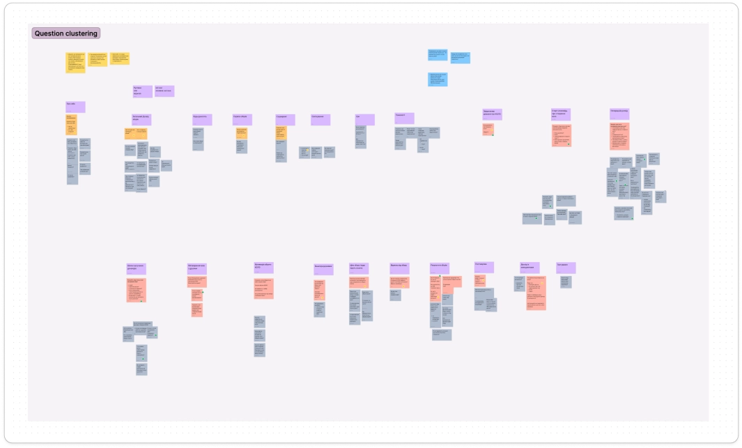
After receiving the project brief, we conducted stakeholder interviews to gain a deeper understanding of the subject area and domain. It was crucial to uncover any existing technical constraints as well. We brainstormed questions as a team, synthesized them, and divided them into categories.
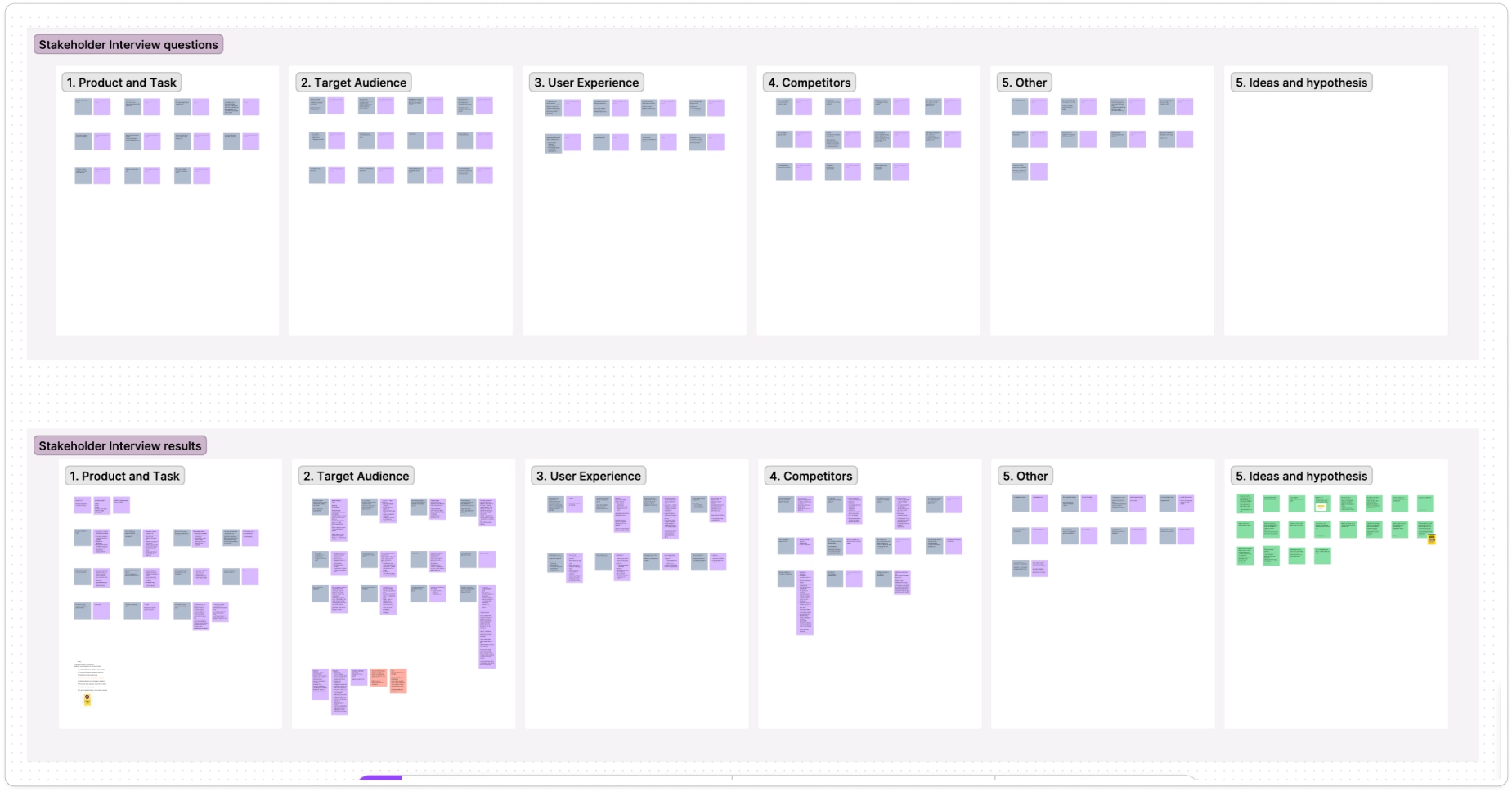
As a result, we defined the product goals and identified key tasks:
- Increase the number of created fundraisers.
- Expand the functionality - add the creation of KOLO fundraiser for different types of events.
- Enable users to choose where collected funds are allocated.
- Identify and resolve issues in the existing flow.
- Add the ability to share created fundraisers.
User interview
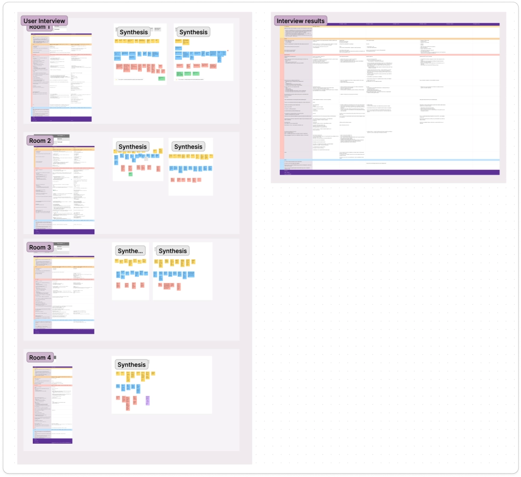
We conducted user interviews to better understand our target users, their behaviours, and their challenges.
Given our large team of skilled designers, product managers, and product owners, we split into two groups to explore the experiences of two distinct user types (personas). We interviewed six donors and seven fundraiser creators.
My team focused on communicating our research findings clearly to the other team, as our objectives centered on the fundraiser creators. We brainstormed and grouped our questions to ensure a comprehensive approach.
Key insights from interviews
#1 It's important for creators to select the purpose of the fundraiser - this way the donors know where the money goes and are more motivated.
#2 Users want to see statistics and the history of their fundraisers.
#3 Users prefer creating fundraisers not only on birthdays but on other events as well, as this expands the feature's usability.
#4 Users need reassurance that even small amounts are valuable, as the fear of raising insufficient funds deters them from starting fundraisers.
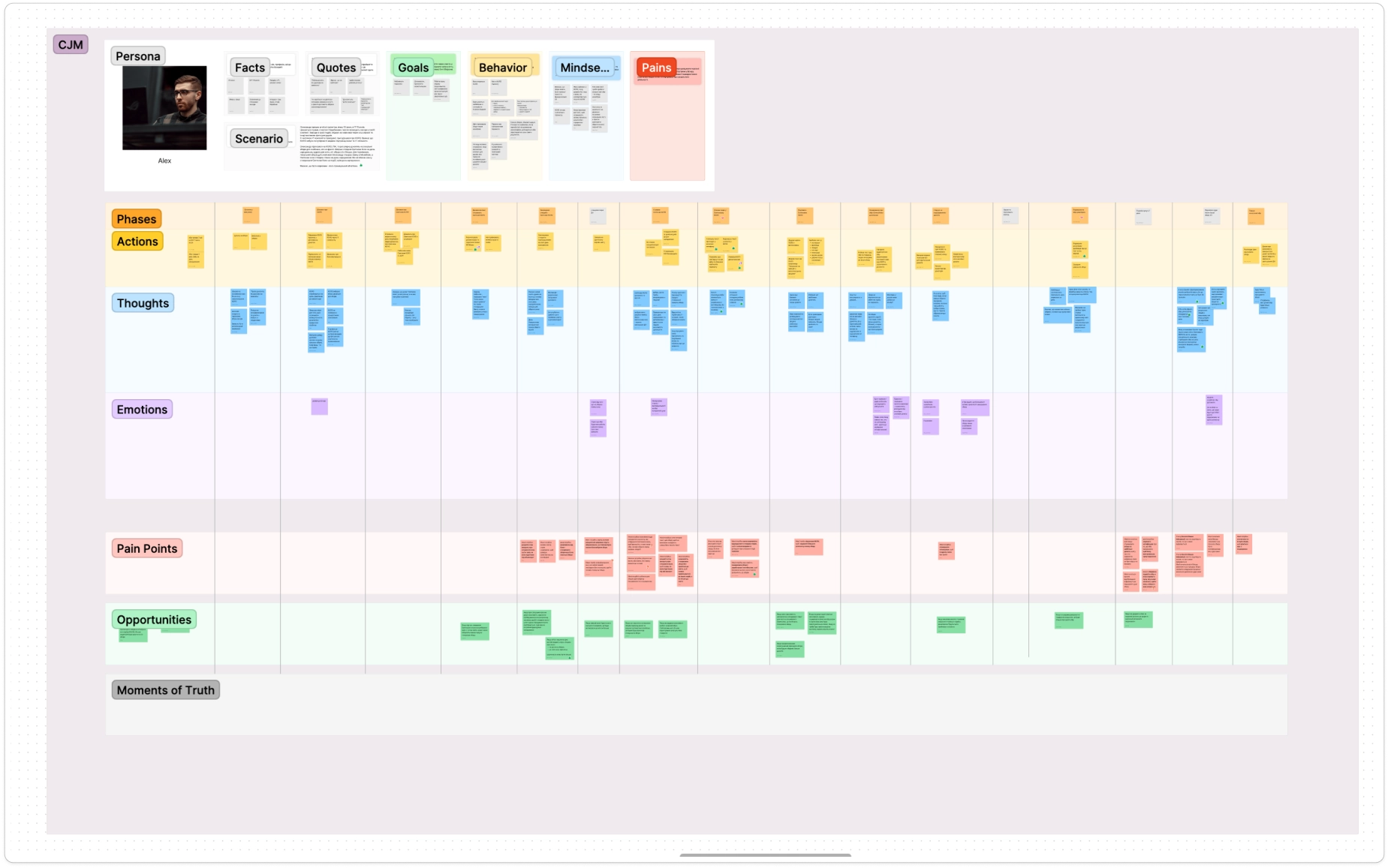
User Personas and CJM
To foster a deeper empathy for our users and their challenges, we created user personas.
We then structured all insights and pain points into a Customer Journey Map (CJM) to visualize the user's interaction with the product.
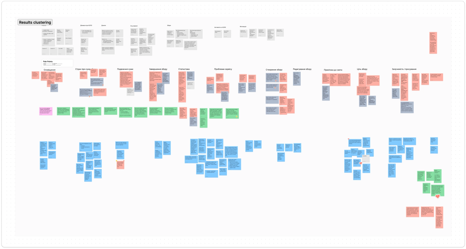
During the CJM clustering, we made numerous edits, particularly in pain points, to ensure clarity for our colleagues (who interviewed the donors), enabling them to work effectively with this information.
Severity Analysis
To prioritize user problems, we conducted a severity exercise.
Each team member voted on the pain points based on Frequency, Impact and Persistence. We evaluated every pain point and selected 3 to address in this sprint, since there were 3 product designers and 1 product manager in the team.
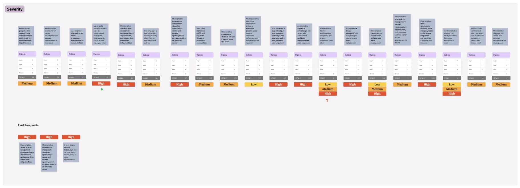
Final Pain Points
#1I need to know what specific direction the collected funds will go to so that I can choose the fees myself.
#2I need the ability to create campaigns without any holiday so that I can link them to other events and not just the holidays.
#3I want to see more information about where the funds go and what happens to them at the end of the event.
How Might We
We engaged in the HMW activity to describe the task as broadly as possible, fostering a wide range of ideas.
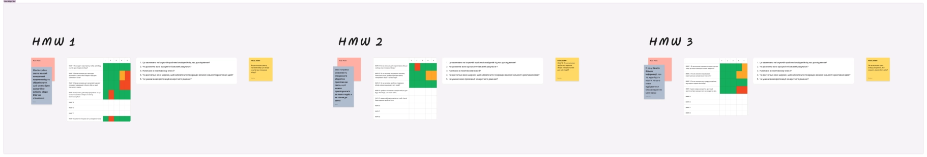
During this activity I ensured our HMW ideas aligned with product goals and user problems.
HMW 1 How might we give the user a flexible choice of fundraising goal when creating a fundraiser?
HMW 2 How might we give the user an understanding of what benefit his foundries brought?
HMW 3 How might we make fundraises creation universal for all types of events?
Crazy Eights
We conducted a Crazy Eights exercise to generate a wide range of solutions for our problem.
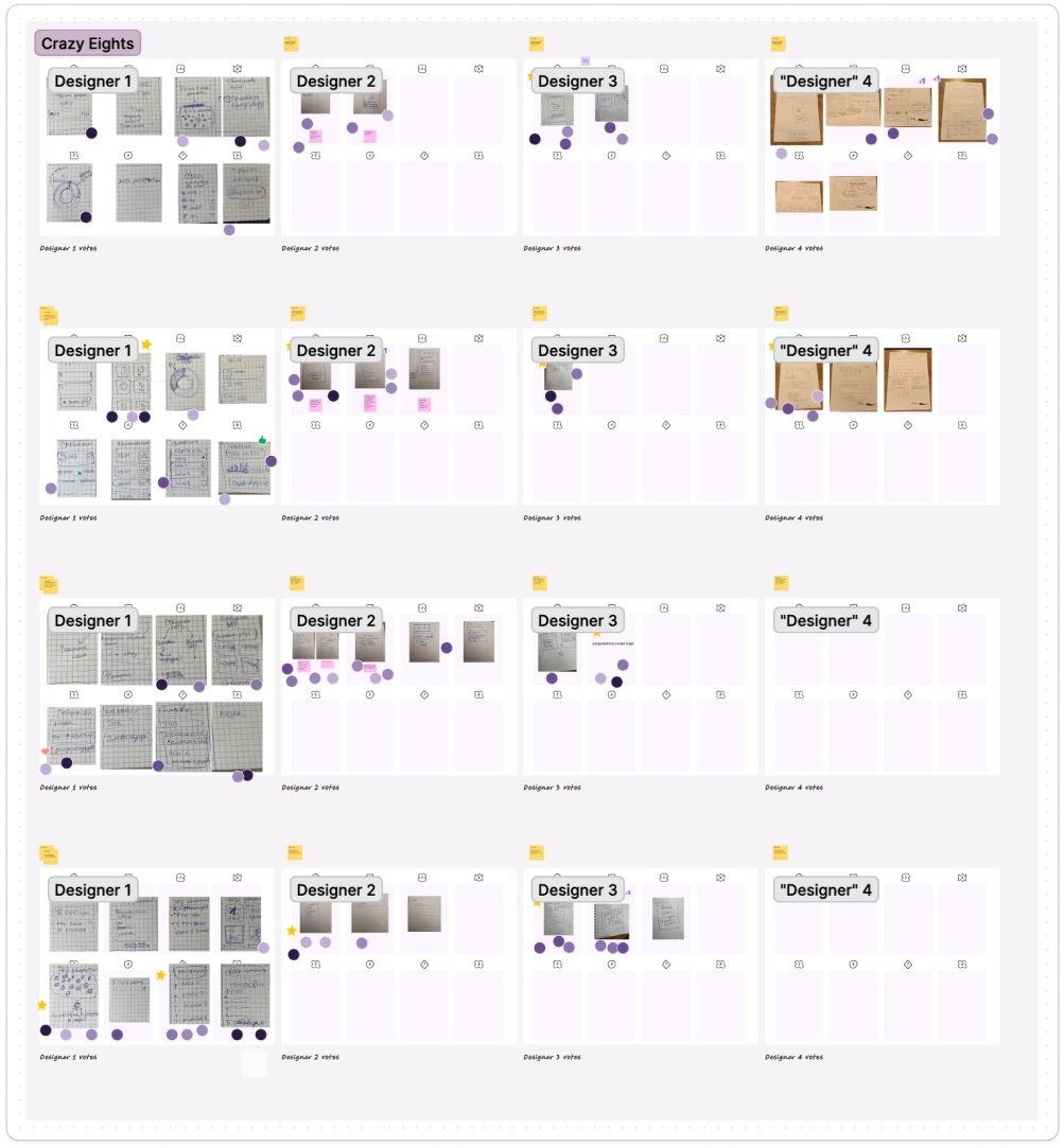
We then voted for the best ideas and grouped some similar and complementary sketches into 1 HMW to test multiple features in this sprint.
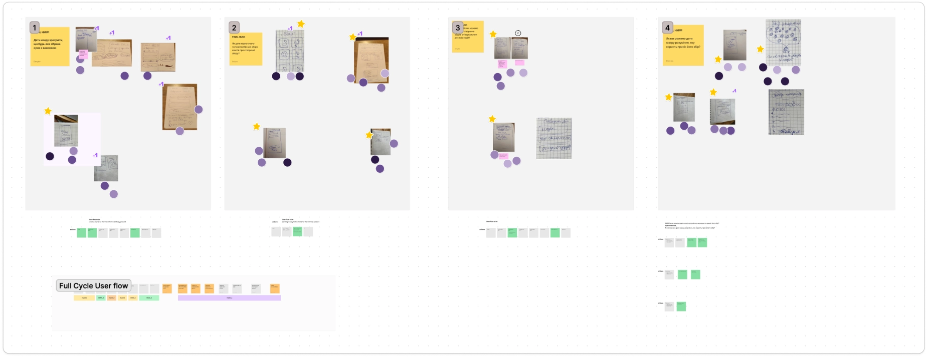
We then quickly assigned HMWs to each designer and combined them into 1 Full Cycle User Flow.
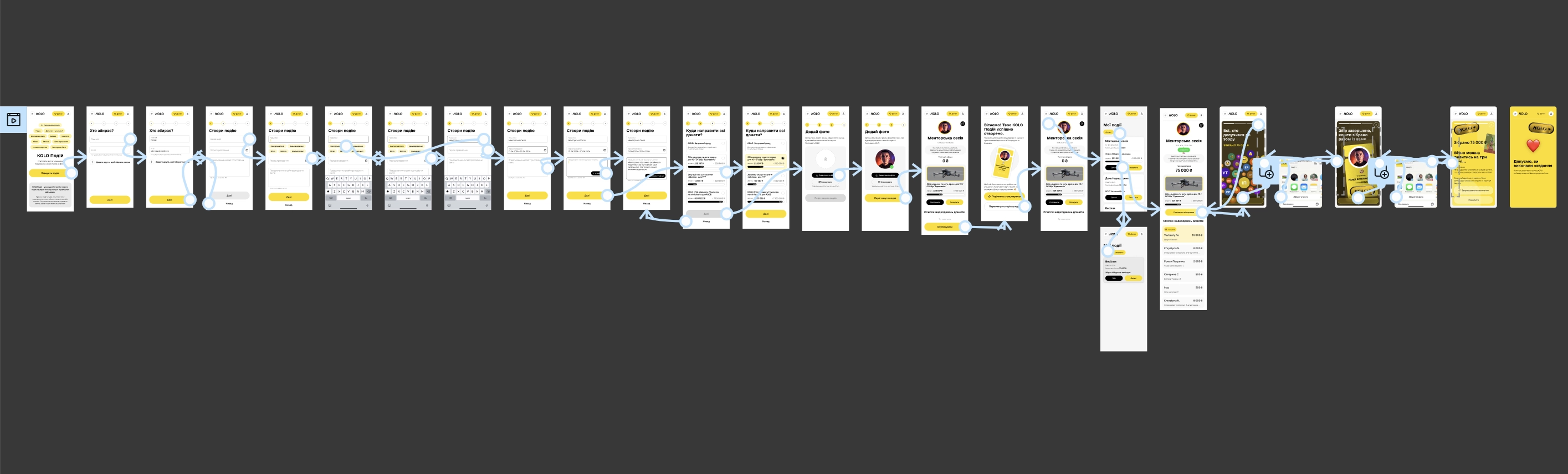
Prototyping
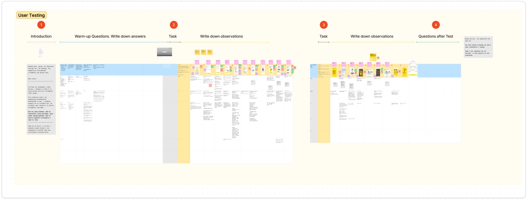
User Testing Results
We conducted the user testing to collect user feedback and response to designs.
User Problem #1
I need the ability to create campaigns independent of holidays so that I can link them to other events.
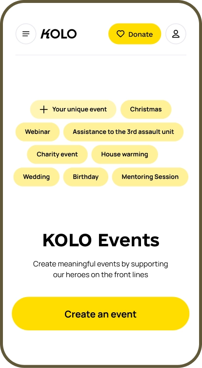
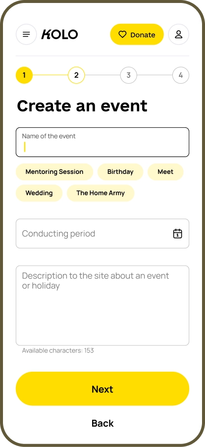
I started with the main page to showcase the new feature that allows users to create any event they desire at the very first interaction with the app. I added badges with random event names and a "Your unique event" badge to present this new feature to users.
User testing revealed that some users wanted to click these badges, so we made them clickable :)
User Problem #1
We added clickable labels for quick event name selection.
However, further user testing showed that users didn't notice labels or didn't understand they are clickable. Also, users didn't know whether they could create the label on their own instead of choosing the suggested ones.
User Problem #1
I suggested adding a custom time frames for campaigns, as the old design limited all campaigns to seven days.
To assist users in crafting descriptions, we integrated AI-generation of descriptions, as not all users are interested in writing long texts.
User Problem #1
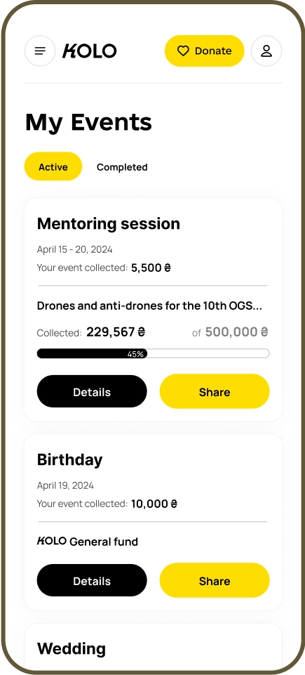
I created a card list of active and completed campaigns, allowing users to track progress, see timeframes, view collected amounts, and share campaigns without visiting the details page.
User Problem #1
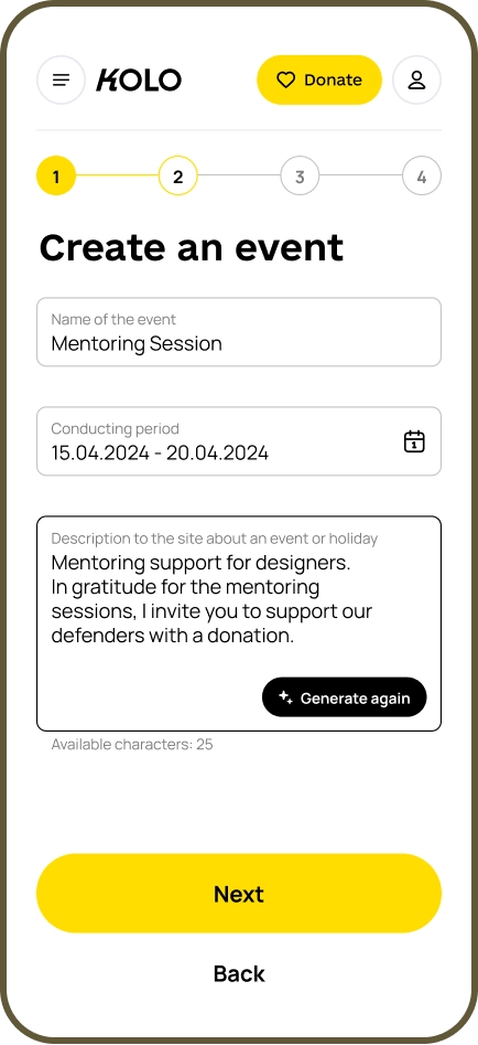
Here I added all the necessary details for the campaign and the ability to edit it.
After user testing we added a campaign preview feature, enabling users to verify their input before publishing.
User Problem #1
After user testing we also separated the card with targeted campaign and made some changes in progress bar and the collected amount, to make the interface more consistent.
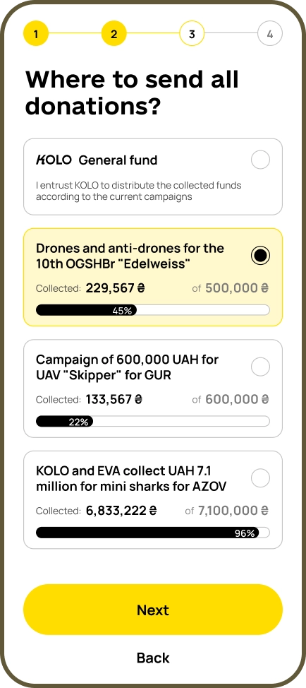
User Problem #2
I need to know what specific direction the collected funds will go to so that I can choose the fees by myself.
We introduced the ability to select targeted campaigns with progress bars in the cards. User testing revealed that these progress bars significantly influenced user decisions.
Some users preferred campaigns with smaller amounts needed, while others chose mid-range campaigns to avoid the risk of the target being met and the campaign closing early.
User Problem #3
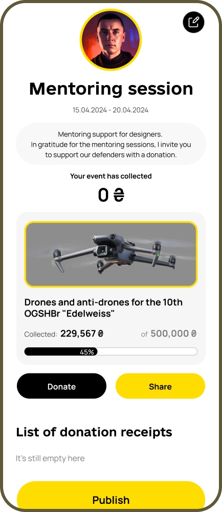
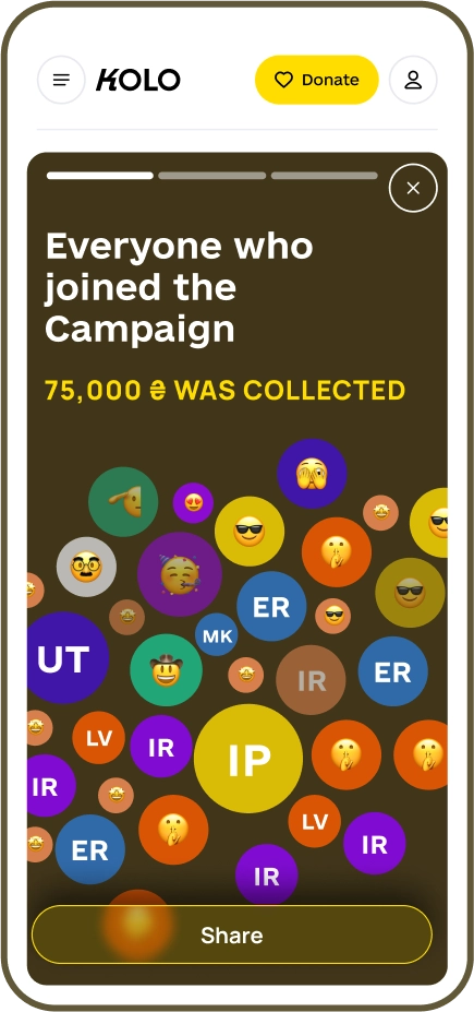
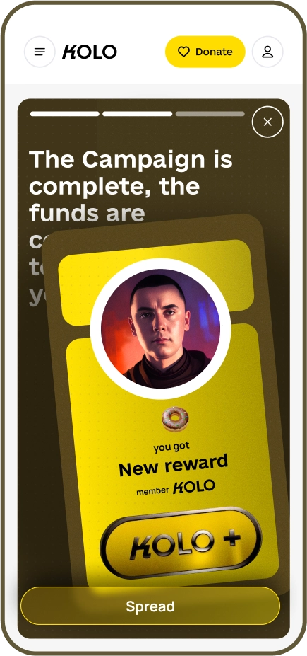
I want to see more information about where the funds go and the outcomes at the end of the events.
We added generated images for Instagram, allowing creators to share event results and see a report showcasing the benefits of their donations.
Additionally, we introduced achievements for event creators.
Before testing, these first two screens were reversed. User feedback indicated it was better to praise campaign participants first, then show the creator's reward.
Learnings
During this design sprint, we identified ways to increase the number of festive circles based on user interviews: adding targeted campaigns, clear reports, and expanding the list of fundraising events.
While many hypotheses were validated, one was not: users didn’t like gamification. They preferred equal recognition over competition, as they didn’t want others to feel their donations were small. This led us to discard gamification ideas and focus on alternative engagement strategies.